OCHA 30th
Anniversary
Role: Art Direction & Visual Strategic
Organization: United Nations OCHA
Brand Identity
Humanitarian Campaign
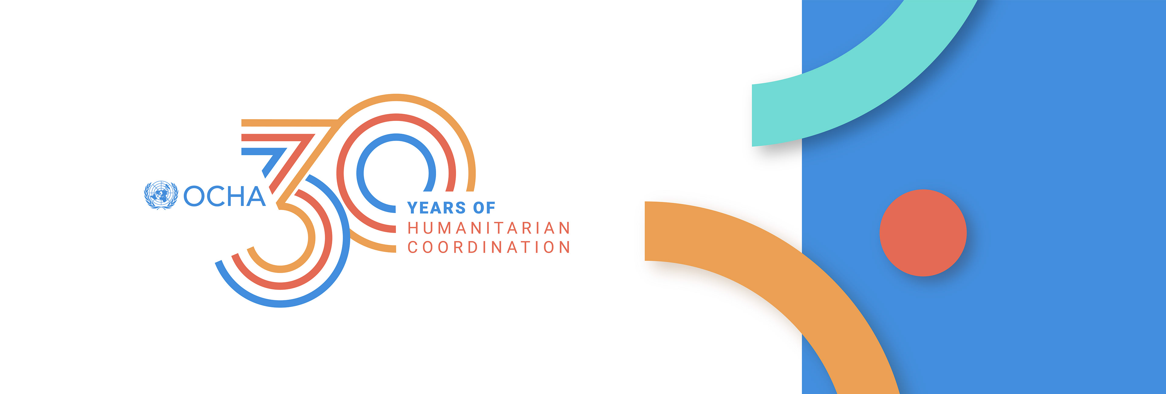
The 30th anniversary of OCHA presented a pivotal opportunity for me to play a key role, as part of the team, in shaping the visual and strategic concept behind its first-ever commemorative identity.
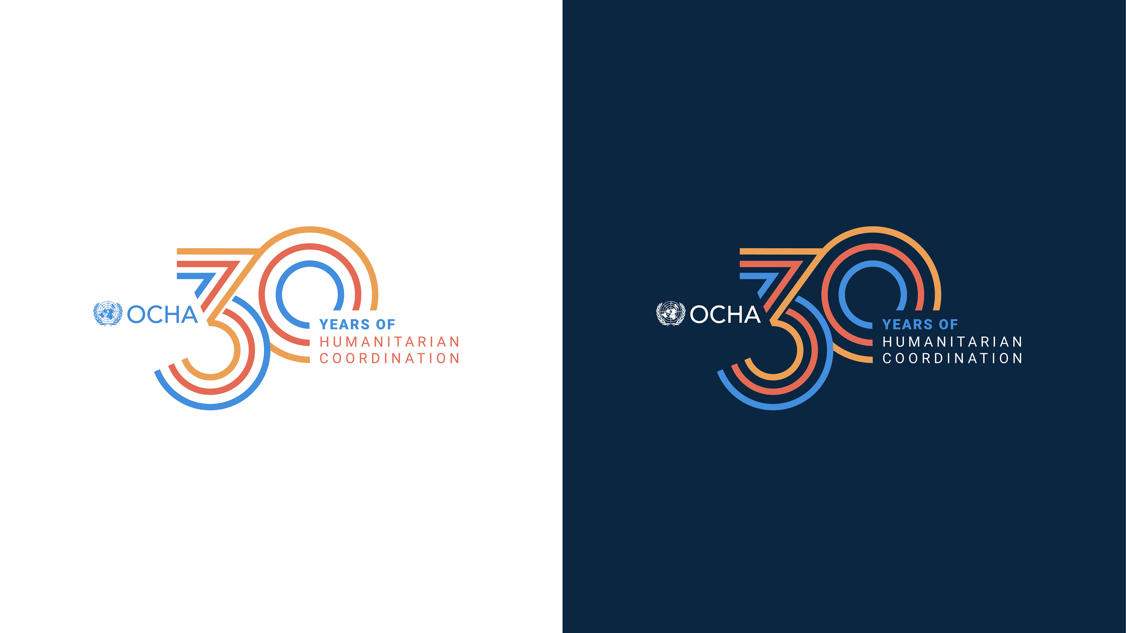
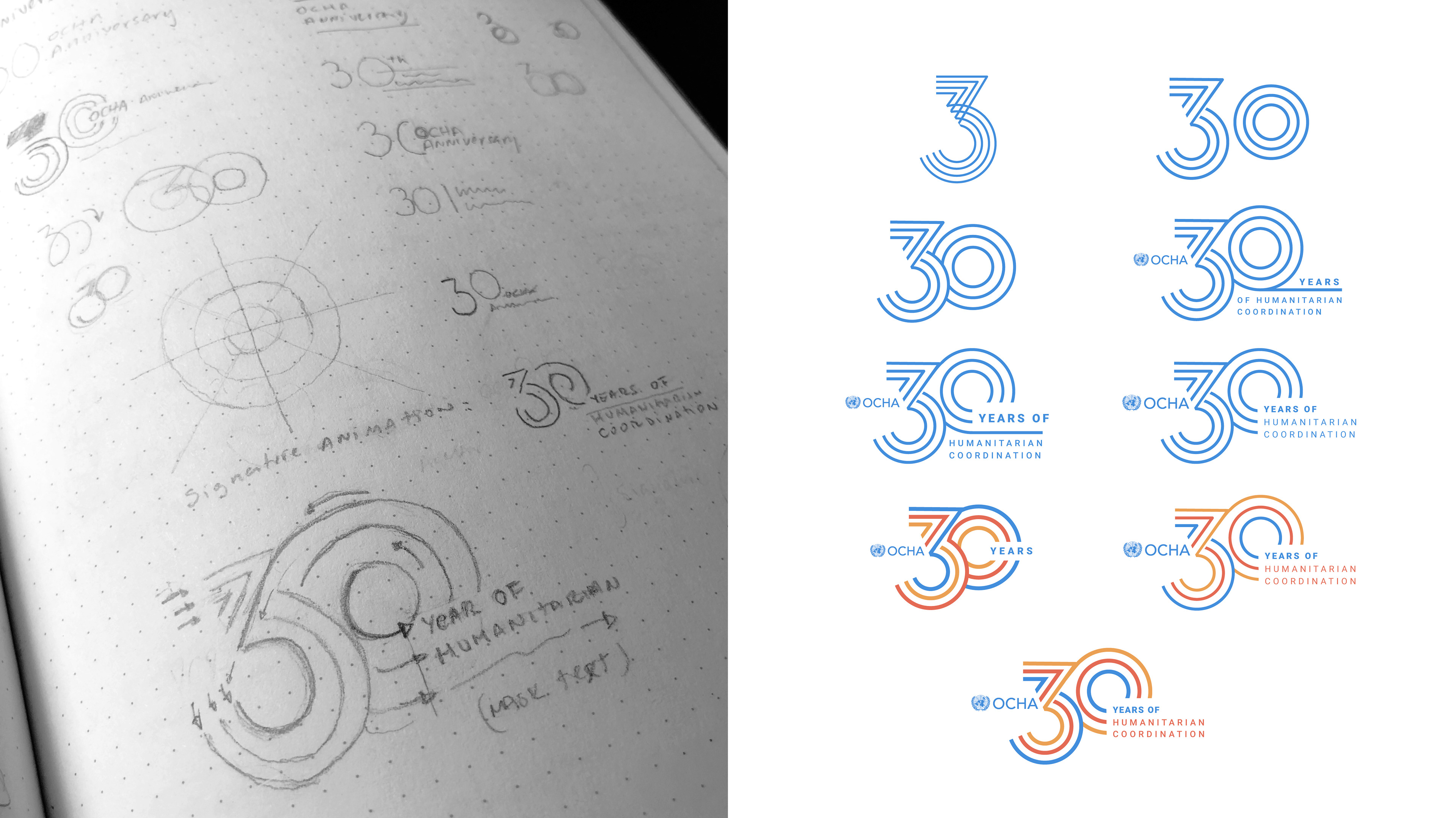
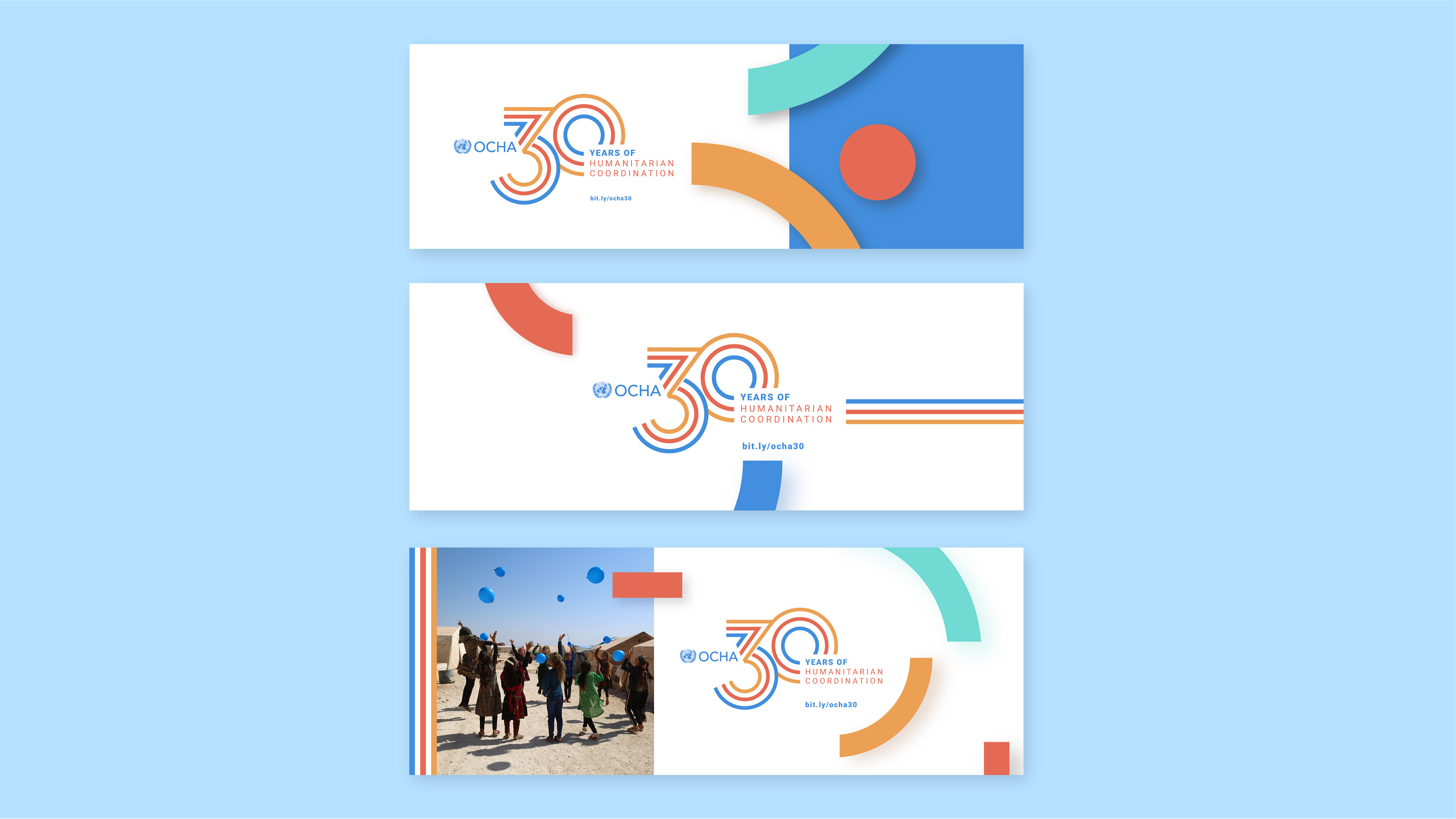
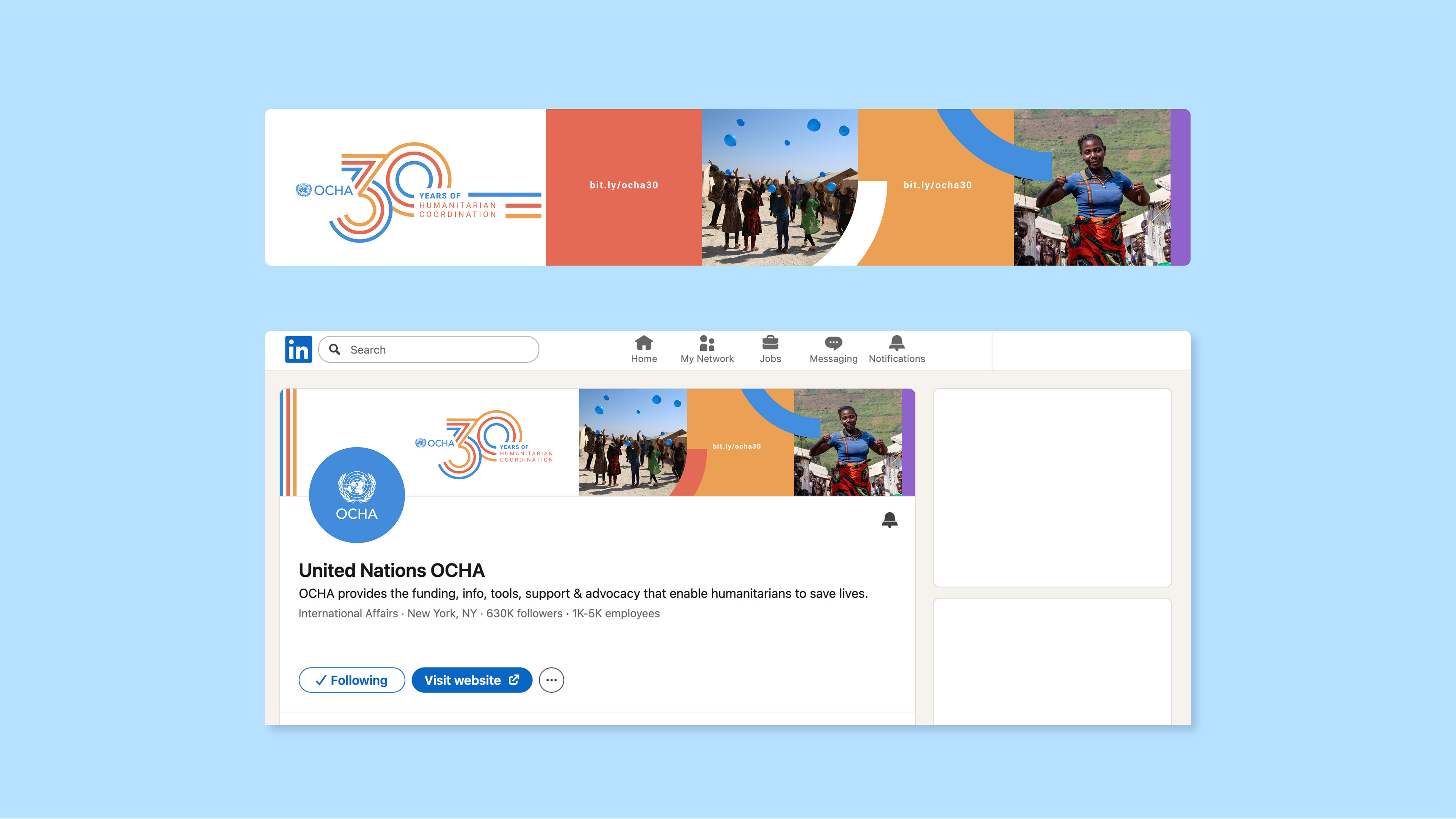
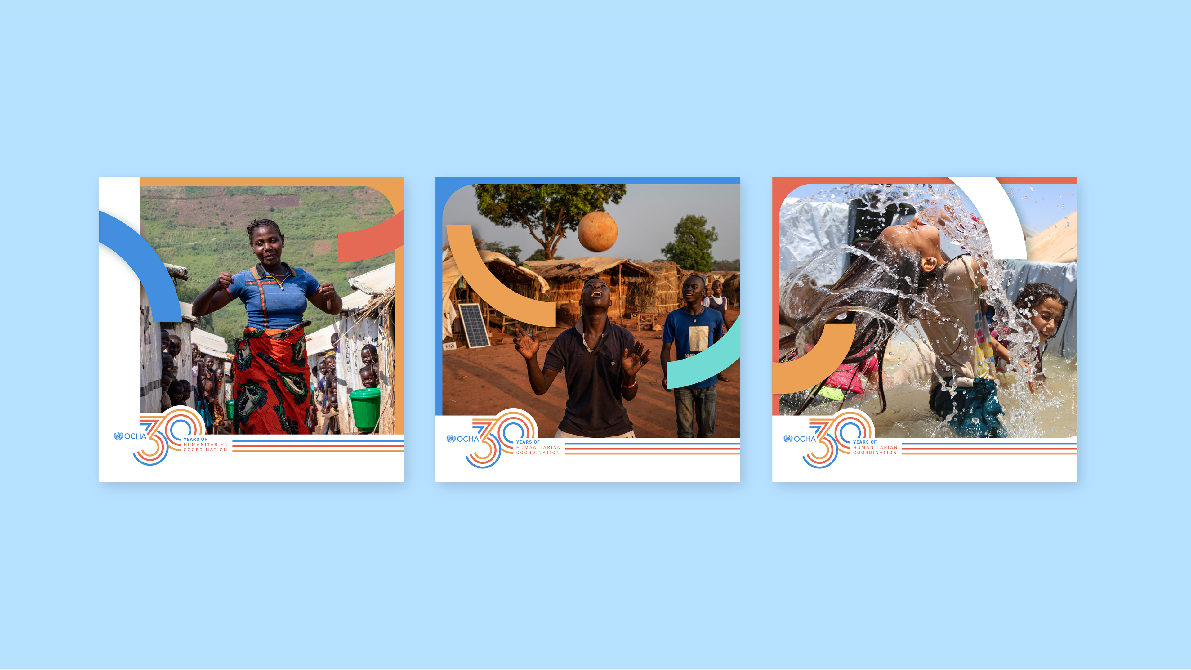
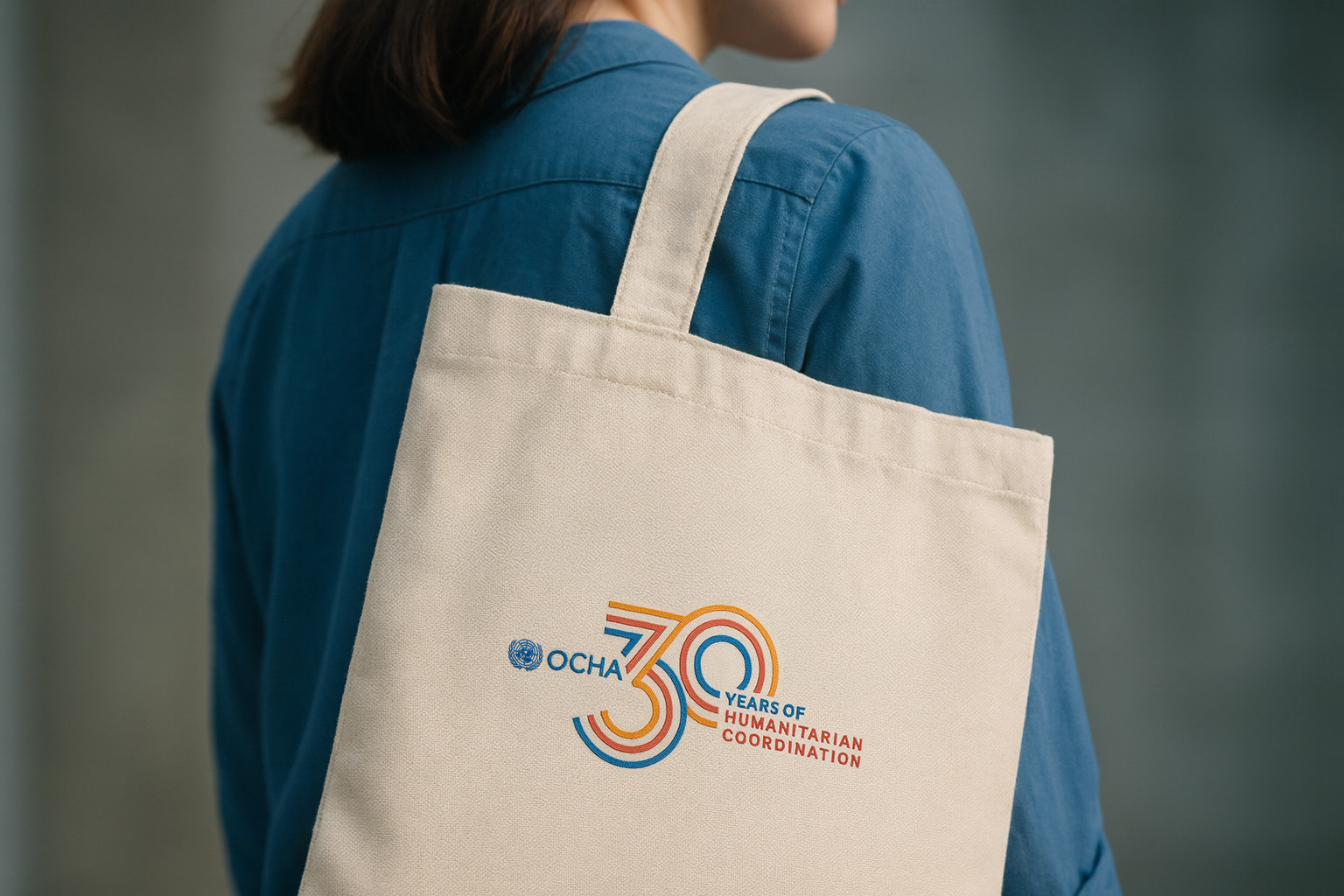
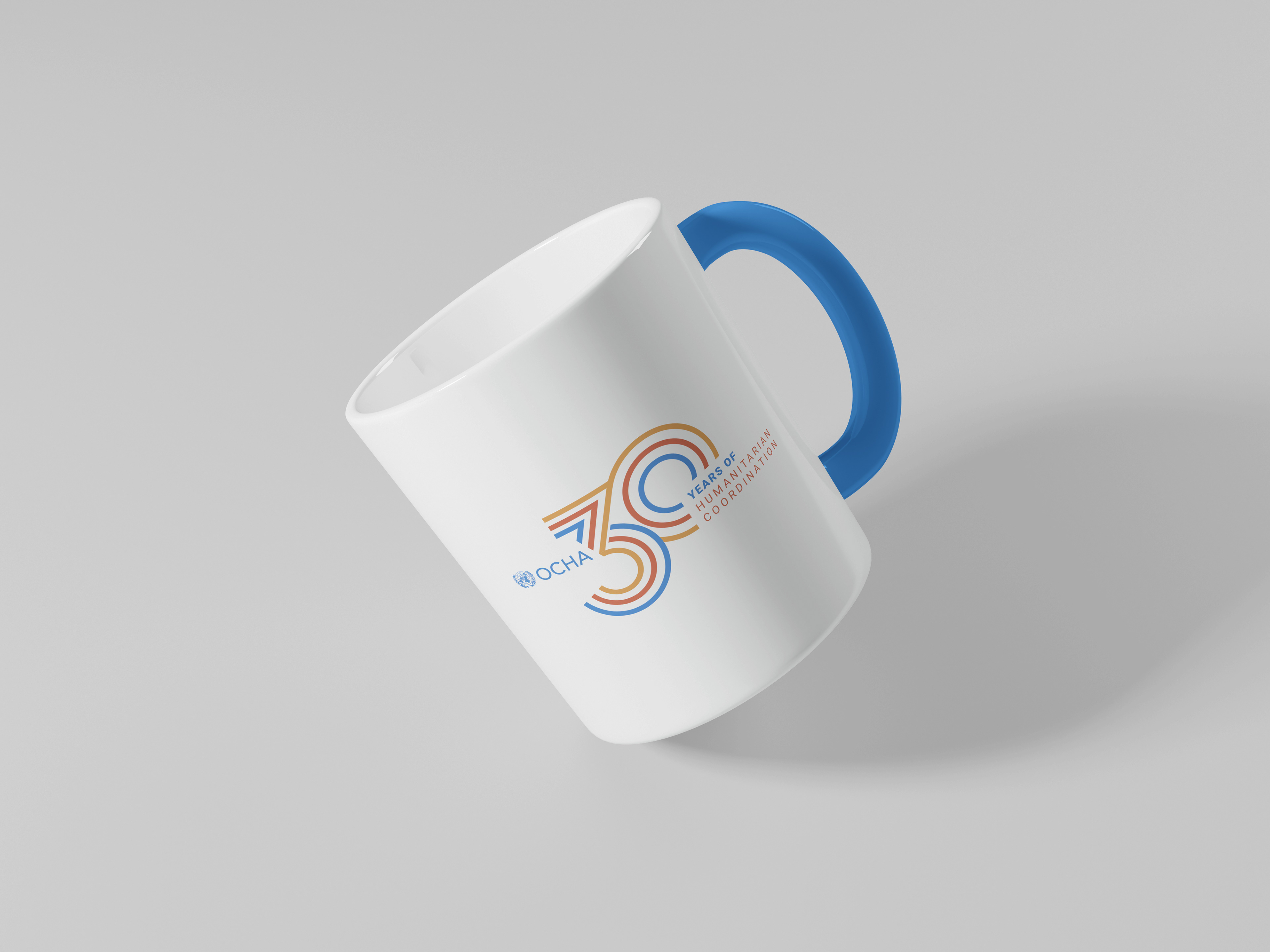
The challenge: breathe life into a commemorative graphic identity that clearly structures OCHA / 30 YEARS OF / HUMANITARIAN COORDINATION, keeping Humanitarian Coordination as OCHA’s core mission. My concept focused on the number 3—an echo of “30”: three lines that form the 30, weave into OCHA’s logo, and guide the reading flow, turning the mission into an integrated tagline. I added three accent colors from OCHA’s palette—Years of in UN blue, Humanitarian Coordination in red—as connecting threads for the system. Starting with two offset circles, I created a dynamic composition that prioritizes: OCHA logo first, then 30, and finally the mission as a strong close—three elements in perfect balance and hierarchy. From there, I developed the full identity: the commemorative logo and a social-media ecosystem that’s consistent, adaptable across formats and platforms, and carries a positive, energetic vibe in every piece.
I’m truly grateful for the trust and opportunity given to me to contribute and drive this project as part of the OCHA team, celebrating three decades of humanitarian coordination with a fresh, positive, and energetic look.
Visual Identity System
.